XO Mineral Water Packaging
Mineral Water Packaging
Client: XO
Creative & Graphic designer: Sadaf Fadaeian
Illustrator: Sadaf Fadaeian
The depletion of water resources these days is the biggest concern of environmentalists. The drying up of the “Zayandeh Roud” and the dehydration of the “Amazon” will cause the extinction of plant and animal species. So I decided to take a small step to help preserve this vital resource by presenting an idea for the packaging of mineral water that is used by the general public and flipping through the issue of water scarcity.
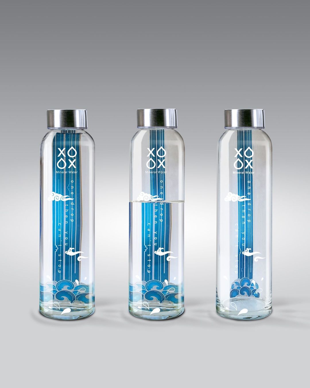
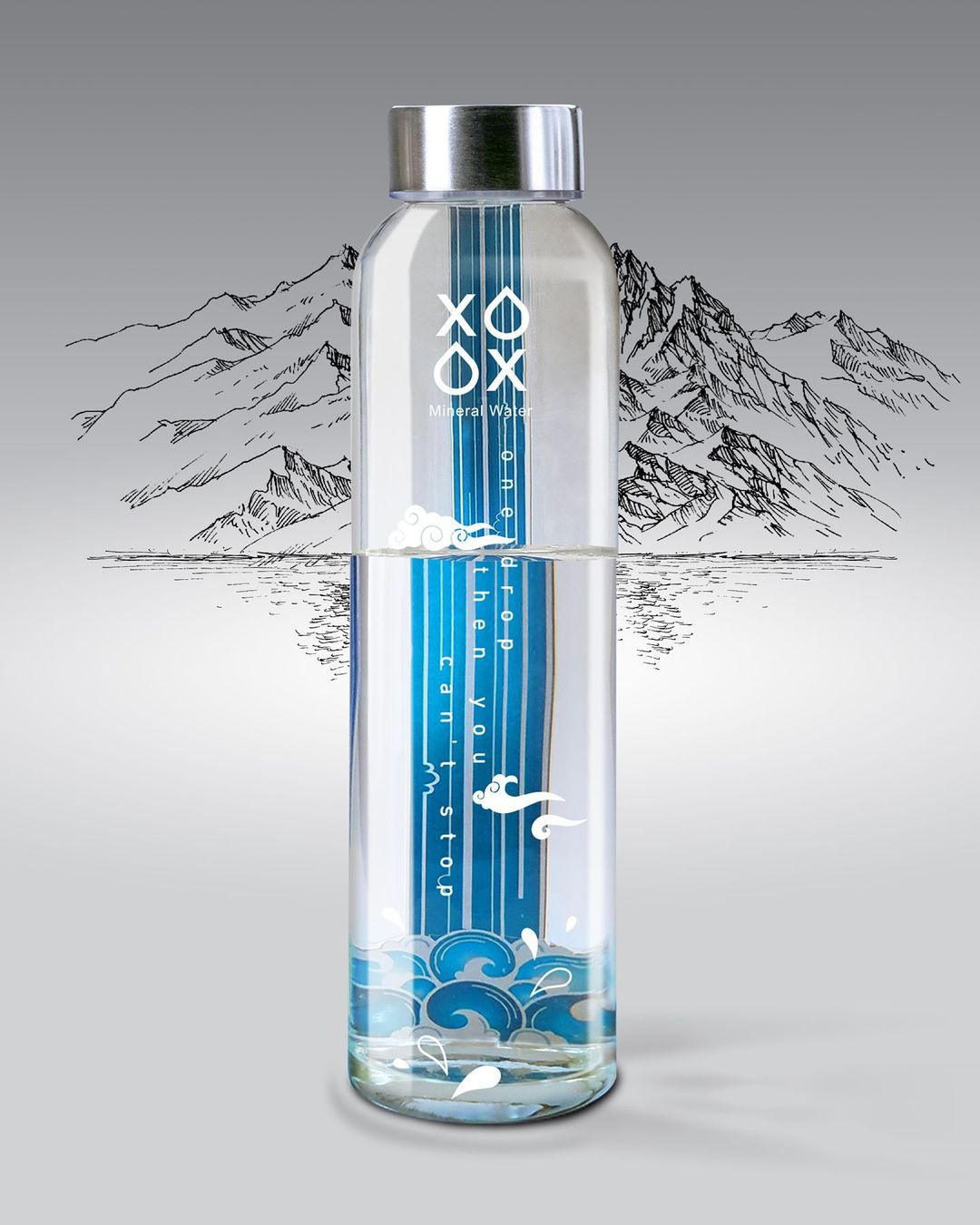
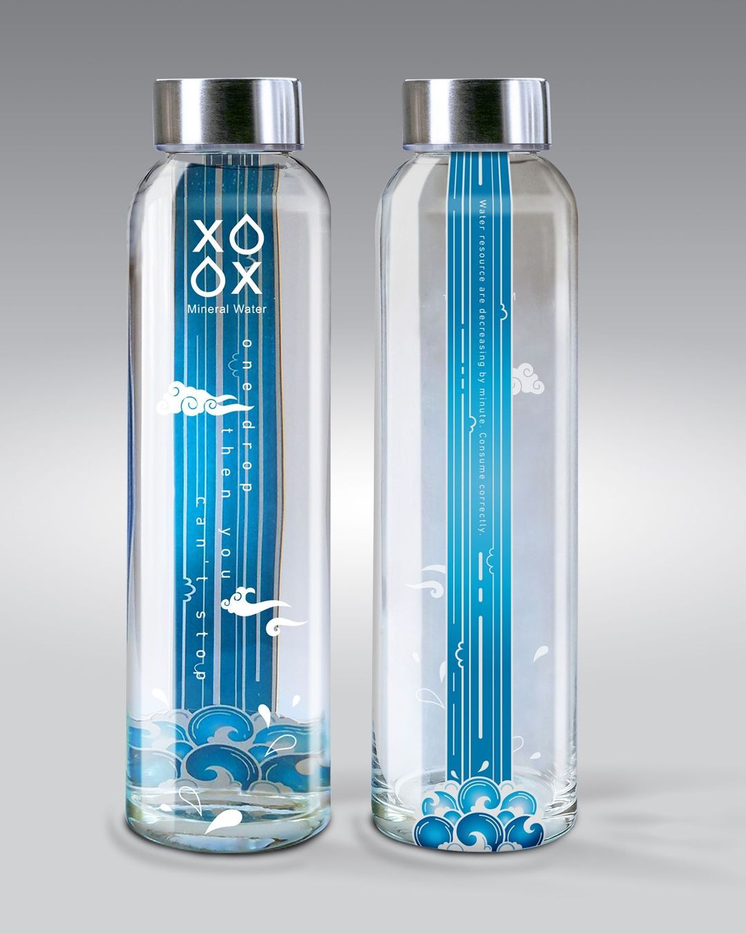
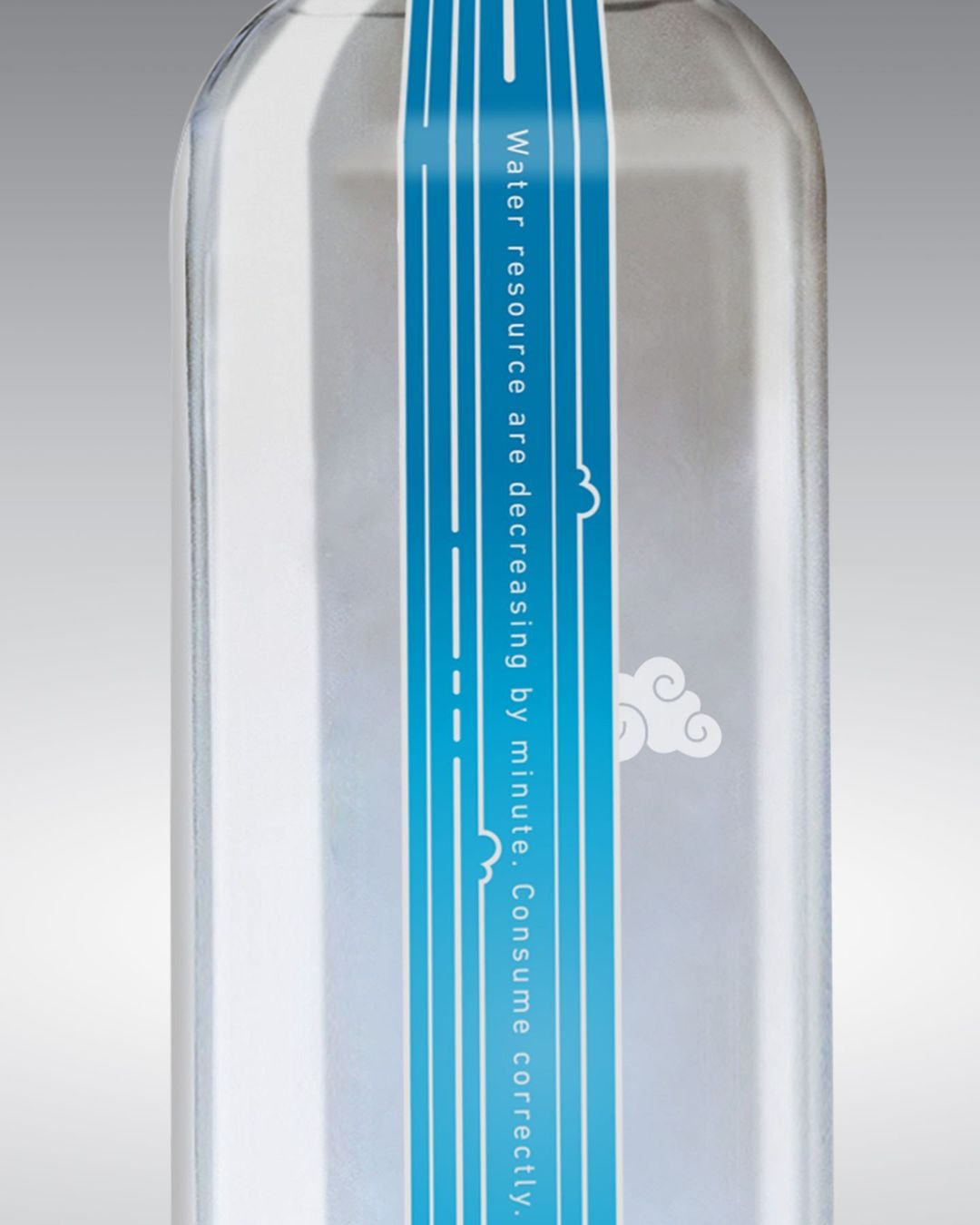
I considered the brand name of mineral water as XO, and by converting the form O to a drop, and X, which indicates the absence of water, and the nostalgic game of XO, and that both options are winners in this logo, I give this option to the audience which path to choose . To design the packaging, I designed a waterfall inspired by Iranian miniatures in a simplified way, which is pasted as a double-sided label on the back of the glass. The fullness of the bottled water and the effect that the refraction of water has on the image of the waterfall make the waterfall larger and wider. Drinking together makes the waterfall narrower and less watery. To design the packaging, I designed a waterfall inspired by Iranian miniatures in a simplified way, which is pasted as a double-sided label on the back of the glass. The fullness of the water and the effect that the refraction of water has on the image of the waterfall make the waterfall larger and wider. With each drink, the waterfall becomes narrower and less watery. The slogan “One drop, then you can’t stop” emphasizes both the palatability of XO’s water and the misuse of this vital reserve, which leads to an environmental catastrophe. Placing miniature clouds on the glass creates a three-dimensional space with a waterfall.
Behind the waterfall, the concept is explained in one sentence that water reserves are dwindling every minute. Consume correctly.
